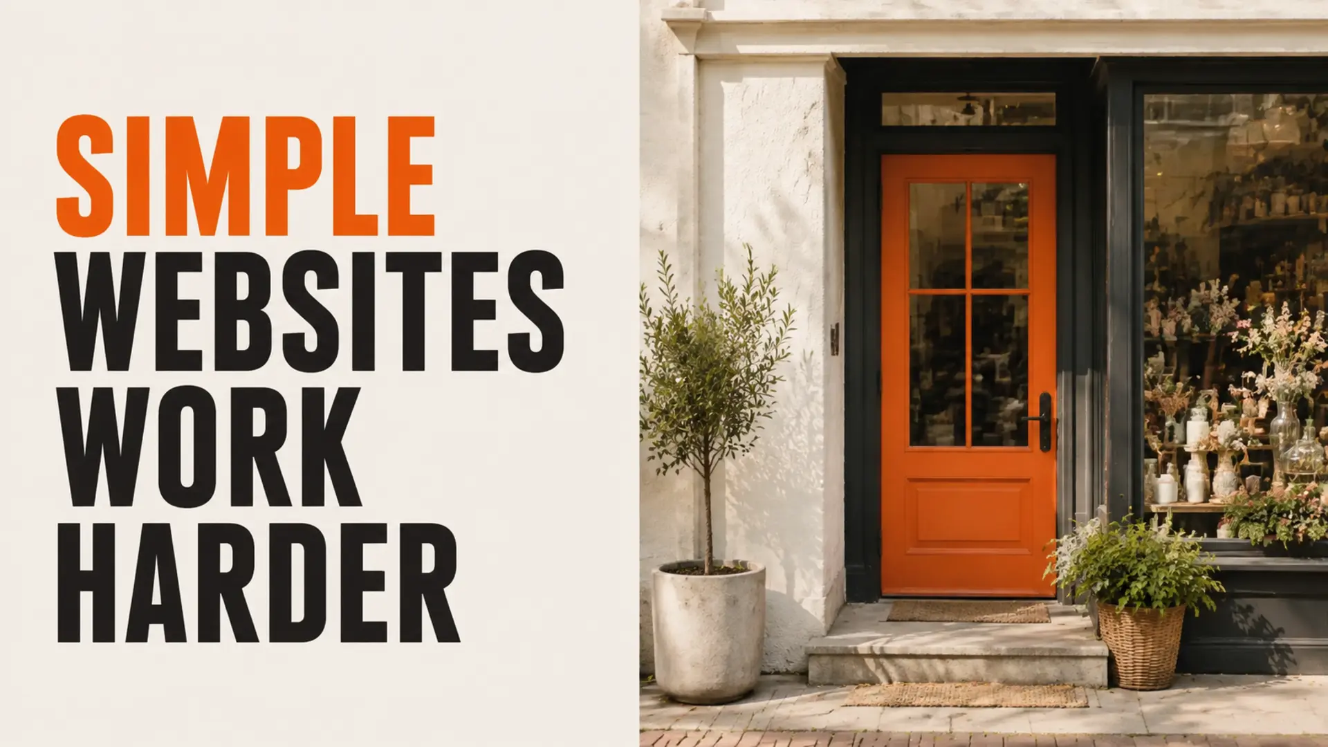
A visually simple website can outperform an elaborate one when it helps customers understand the offer and act with less friction. That does not mean every “boring” website makes more money. It means simple website design often supports conversion when clarity, accessibility, performance and trust matter more than decorative effects.
Why Simple Website Design Can Work Better
Customers usually arrive with a task: compare a service, find an answer, check credibility or contact the business. A focused page makes the next step obvious. A heavily animated or unconventional page can still work, but every effect should support the task rather than compete with it.
Clarity Before Decoration
- Use a headline that explains the offer.
- Keep navigation labels familiar and specific.
- Group related information under descriptive headings.
- Use one clear primary action per section.
- Remove elements that do not help the intended customer.
Professional UI and UX design balances brand expression with understandable interaction.
Readable Contrast and Accessible Type
Text should remain readable across devices and lighting conditions. Avoid low-contrast colour combinations, very small type and text placed over busy photography. Strong hierarchy helps people scan without losing important details.
Performance Supports the Experience
Large media, excessive scripts and unused effects can delay interaction. Performance-focused web development can improve asset delivery, code behaviour and reliability without forcing every website into the same visual style.
Simple Does Not Mean Generic
A simple website can still use distinctive typography, photography, colour and layout. The difference is discipline: the visual system reinforces the message, and decorative choices remain secondary to content and usability.
Measure the Actual Customer Journey
Do not assume that a redesign improved conversion because it looks cleaner. Test forms and links, review meaningful analytics, observe where users struggle and compare qualified enquiries over an appropriate period. If visitors arrive but do not act, examine the reasons website traffic may not produce leads.
Conclusion: Make Every Element Earn Its Place
The best design is not necessarily plain or elaborate. It is the design that communicates clearly, works reliably and helps the intended customer complete the right task. Remove friction first, then add personality without weakening usability.
Ready to Build a Stronger Online Presence?
Talk with TruWebz about a faster, clearer website built to attract and convert the right customers.
Frequently Asked Questions
Do simple websites always convert better?
No. Results depend on the audience, offer, traffic and implementation. Simplicity helps when it improves clarity, speed, accessibility and trust.
What makes a website feel cluttered?
Competing calls to action, excessive effects, dense copy, unclear hierarchy and decorative elements without a useful purpose can create clutter.
Can a simple website still look premium?
Yes. Strong typography, spacing, photography, colour and consistent components can create a distinctive brand without unnecessary complexity.
How should website conversion be measured?
Track meaningful actions such as qualified calls, completed forms, bookings or purchases and compare them with traffic quality and page behaviour.
Should animations be removed?
Not necessarily. Keep animations that provide useful feedback or improve understanding, and remove effects that delay or distract from important tasks.