

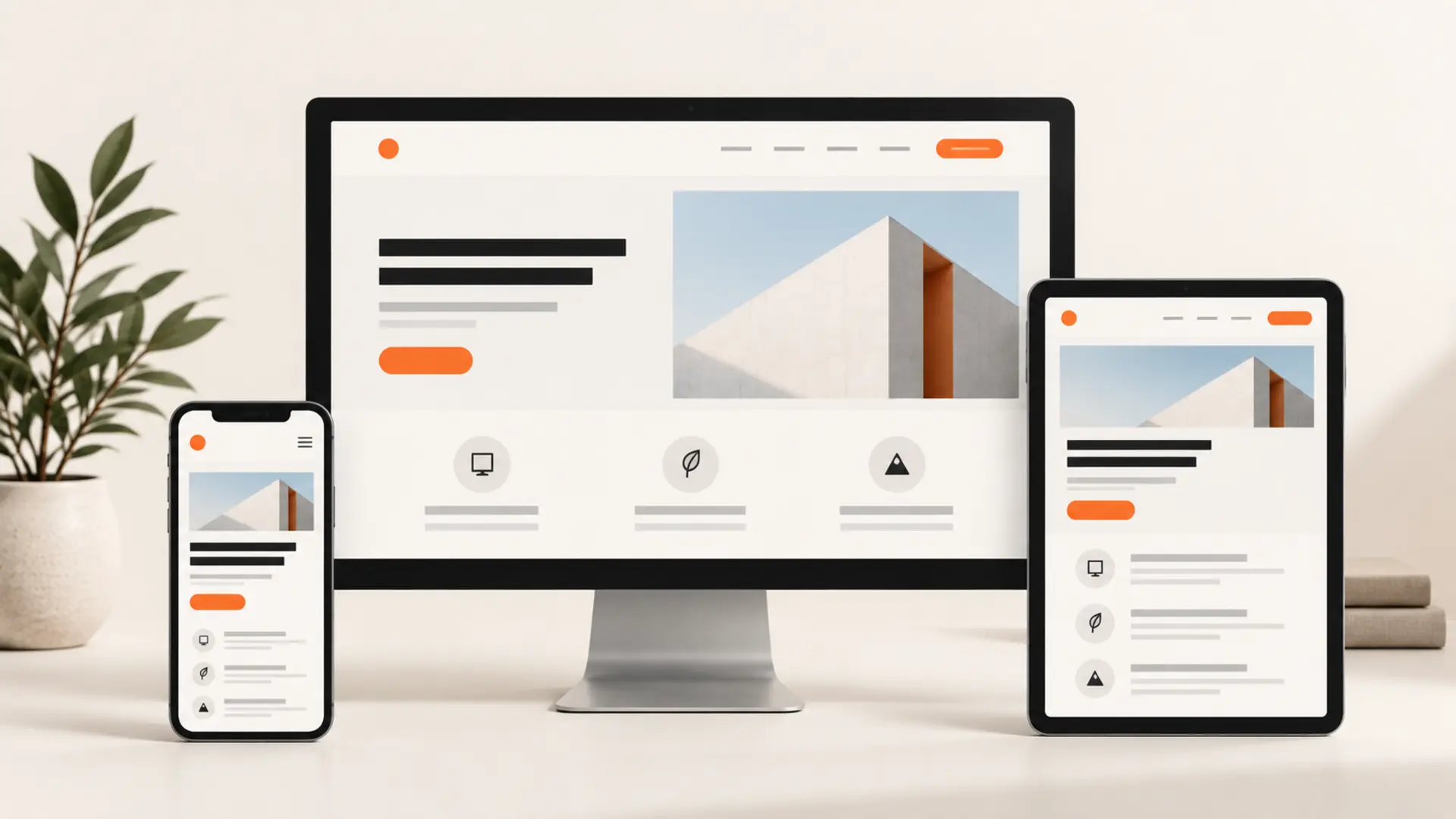
To make a website mobile friendly, use a responsive layout, keep the same useful content on every device, reduce loading time, make controls easy to tap and test the finished pages on real phones. A mobile-friendly website should resize naturally without horizontal scrolling, tiny text or buttons that are difficult to use.
This guide shows you how to make a website mobile friendly step by step, including responsive design, content parity, Core Web Vitals, touch-friendly navigation, readable copy and mobile testing.
Quick answer: Use one responsive URL, add the correct viewport setting, use flexible layouts and images, reserve space for media, simplify navigation and forms, and test important pages at several screen widths.
How to make a website mobile friendly: quick checklist
- Use responsive design on a single URL.
- Keep headings, copy, metadata, structured data and internal links available on mobile.
- Target good Core Web Vitals: LCP within 2.5 seconds, INP within 200 milliseconds and CLS no more than 0.1.
- Make navigation, forms and buttons comfortable to use by touch.
- Format content for narrow screens with short paragraphs and descriptive headings.
- Test the rendered page in PageSpeed Insights and Google Search Console.
1. Check mobile-first indexing and content parity
Google’s mobile-first indexing guidance recommends responsive design and equivalent content, metadata and structured data across device versions.
Parity of Content Across Devices
A frequent mistake web development teams make is hiding content on mobile viewports to keep the design “clean” or reduce visual height. Under desktop indexing, hiding supplementary content was acceptable. Under mobile-first indexing, if content does not exist on your mobile version, it effectively does not exist for Google.
- Equivalent Meta Data: Mobile pages must carry the exact same meta titles, meta descriptions, Open Graph data, and canonical tags as the desktop counterpart.
- Structured Data Parity: Schema markup (such as
Article,FAQPage,Product, orLocalBusiness) must appear on the mobile view of the page. Omitting structured data on smaller viewports strips rich search snippets from search results. - Equivalent Content & Assets: Never prune
critical body copy, headings (
<h2>,<h3>), image alt attributes, or context-rich text solely to shorten mobile page height. Instead, use clean formatting, accordion design elements, or concise styling to handle layout constraints. - Internal Linking Architecture: Ensure primary header navigation menus, breadcrumbs, and in-content contextual internal links remain discoverable and crawlable through mobile touch-menus.
2. Use responsive design to make a website mobile friendly
Historically, engineering teams implemented mobile websites using one of three architectural patterns:
| Architecture Method | How It Operates | SEO Recommendation |
|---|---|---|
| Responsive Web Design (RWD) | Serves the exact same HTML code on a single URL; CSS media queries adapt layout based on screen width. | Industry Standard & Google Recommended. Eliminates duplicate content issues, conserves crawl budget, and preserves link equity. |
| Dynamic Serving | Serves the exact same URL, but the server generates distinct HTML/CSS based on the browser’s User-Agent string. | Acceptable but error-prone. Requires accurate implementation of the
Vary: User-Agent HTTP response header. |
Separate Mobile URLs
(m.example.com) |
Routes mobile visitors to dedicated subdomains via redirection scripts. | Discouraged. Splits backlink equity, demands
intricate bidirectional annotations (rel="canonical" and
rel="alternate"), and frequently creates indexing
bugs. |
Essential Responsive Implementation
Responsive Web Design (RWD) represents the cleanest, most scalable framework. It requires zero duplicate URLs, aggregates all social signals and backlinks into a single URL destination, and minimizes server-side complexity.
To establish responsive functionality, declare a dynamic viewport in
the <head> of every HTML template:
<meta name="viewport" content="width=device-width, initial-scale=1.0">
This directive instructs the mobile browser how to control the page’s dimensions and scaling:
width=device-widthmatches the screen’s width in device-independent pixels.initial-scale=1.0sets a 1:1 relationship between device dimensions and CSS pixels, preventing mobile browsers from rendering the page at a virtual 980px desktop resolution and shrinking it down.
Complement this tag with flexible layouts built on modern CSS
standards (CSS Flexbox and CSS Grid), utilizing fluid units
(%, rem, vw, vh)
rather than hardcoded pixel dimensions (width: 960px).
3. Improve mobile speed and Core Web Vitals
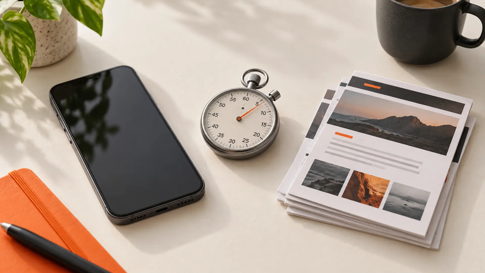
Mobile visitors may browse on slower or unstable connections. Google’s Core Web Vitals guidance defines loading, responsiveness and visual-stability metrics. Treat the thresholds below as experience targets and review field data whenever it is available.
| Core Web Vital | Good target | What it measures |
|---|---|---|
| Largest Contentful Paint (LCP) | 2.5 seconds or less | Loading performance |
| Interaction to Next Paint (INP) | 200 milliseconds or less | Responsiveness |
| Cumulative Layout Shift (CLS) | 0.1 or less | Visual stability |
Largest Contentful Paint (LCP) ≤ 2.5 Seconds
LCP measures perceived loading speed by pinpointing when the primary content element (typically a hero image, banner graphic, or major heading block) renders within the mobile viewport.
Modern Image Compression: Replace legacy formats (
.jpg,.png) with high-efficiency formats like WebP or AVIF, which decrease payload weights by 30% to 50% without degrading visual fidelity.Responsive Image Breakpoints: Serve scaled image dimensions tailored to the user’s hardware via the
srcsetattribute. Delivering an uncompressed 2500px desktop banner to a 390px smartphone screen squanders mobile bandwidth:<img src="banner-medium.webp" srcset="banner-small.webp 480w, banner-medium.webp 800w, banner-large.webp 1200w" sizes="(max-width: 600px) 480px, 800px" alt="Comprehensive SEO Strategy Guide">Preload the Hero Asset: Ensure the browser discovers your LCP image immediately by placing a high-priority preload tag inside your document
<head>:<link rel="preload" fetchpriority="high" as="image" href="hero-mobile.webp" type="image/webp">Implement a Content Delivery Network (CDN): Route your static assets through edge servers geographically situated close to your visitors to slash Time to First Byte (TTFB).
Interaction to Next Paint (INP) ≤ 200 Milliseconds
INP tracks user responsiveness across a page’s entire lifecycle—measuring latency every time a visitor taps a link, expands an accordion, or clicks a mobile menu button.
- Break Up Long JavaScript Tasks: Heavy scripts
running longer than 50ms monopolize the browser’s single main thread.
Split intensive compute functions into asynchronous microtasks using
setTimeoutorrequestIdleCallback(). - Defer Non-Critical Scripts: Audit your site for
bloated marketing tags, heatmap trackers, and analytical plugins. Load
non-essential JavaScript asynchronously (
asyncordefer) so critical user interactions take precedence. - Minimize Third-Party Runtimes: Every analytics platform, chat widget, and dynamic ad container slows mobile CPU execution. Audit script usage regularly and remove outdated tracking tags.
Cumulative Layout Shift (CLS) ≤ 0.1
CLS measures visual stability. Nothing frustrates mobile users more than tapping a button only to have the layout jump unexpectedly due to a delayed image or advertisement, resulting in an unintended tap.
- Explicit Image Dimensions: Always specify explicit
widthandheightattributes on image and video tags, or define an aspect ratio in CSS (aspect-ratio: 16 / 9;). This allows browsers to reserve the exact layout space before media assets finish downloading. - Reserved Ad Slots: Pre-allocate fixed container dimensions for dynamic display advertisements so banners don’t push text down upon loading.
- Font Loading Optimization: Prevent Flash of
Invisible Text (FOIT) or Flash of Unstyled Text (FOUT) by using CSS
font-display: swap;, and match fallback system font metrics to custom web fonts to prevent text reflow.
4. Make buttons, menus and forms easy to use
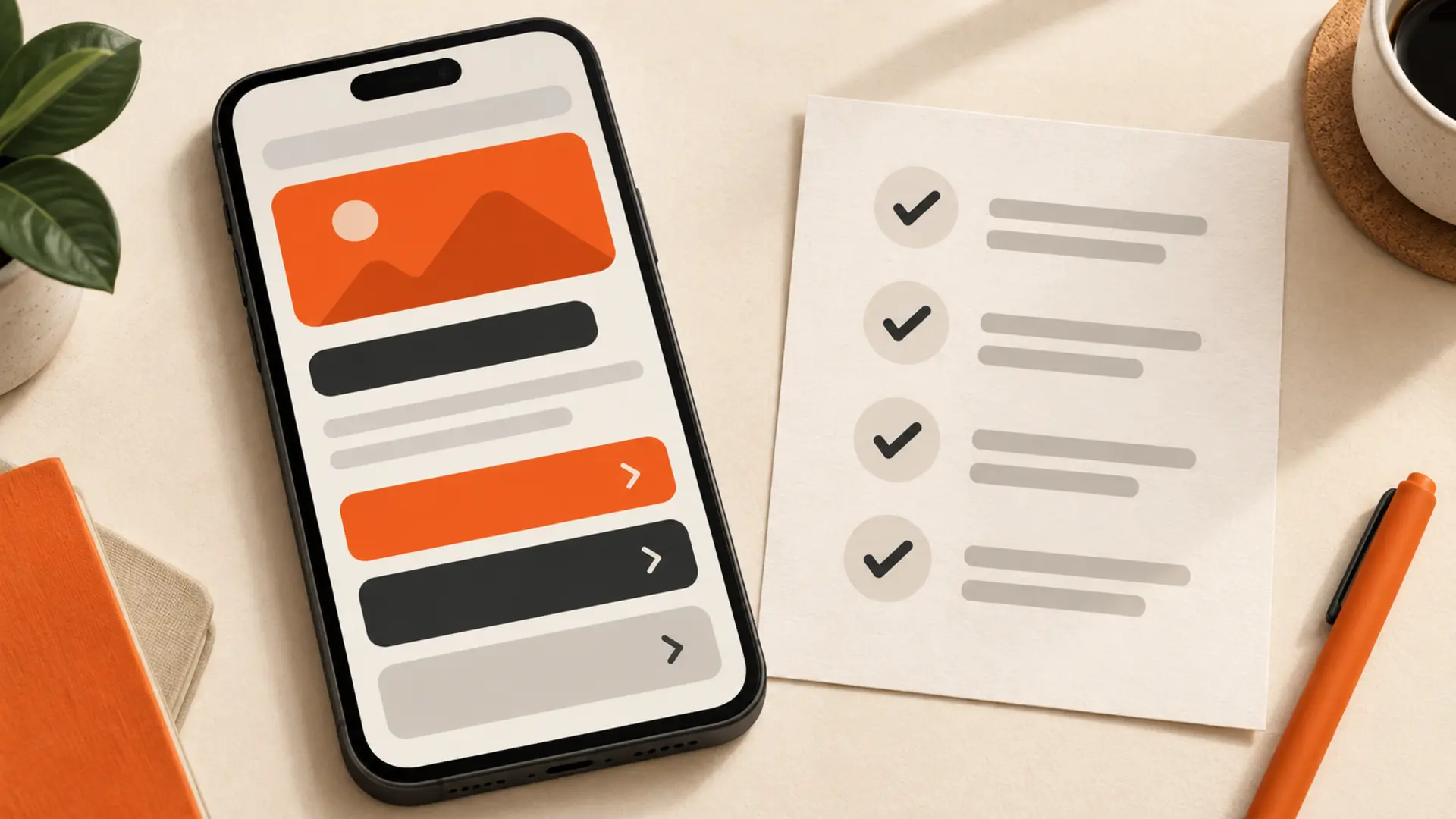
Mobile usability centers on touch input rather than mouse precision. User friction on mobile hardware rapidly sends negative user-behavior signals back to search algorithms through high bounce rates and diminished organic dwell time.
- Top corners: reserve these harder-to-reach areas for secondary actions.
- Centre: keep reading content and common controls within comfortable reach.
- Lower screen: place important navigation and primary actions where thumbs reach naturally.
Touch Target Dimensions and Spacing
Unlike desktop cursors that pinpoint individual pixels, human thumbs require generous landing areas.
- Minimum 48 × 48 Pixel Footprint: Google’s accessibility and mobile usability standards require that tap targets measure at least 48 × 48 CSS pixels.
- Generous Element Padding: Even if an icon itself is 24px wide, expand its interactive boundary using CSS padding to eliminate misclicks.
- Separation Buffer: Maintain at least 8px to 10px of blank space between interactive buttons and text links. Clustering multiple text hyperlinks tightly within a single sentence makes precise tapping frustrating for users.
Navigation and Mobile Menus
- Ditch Desktop Hover States: Mobile devices have no hover state. Hover-dependent dropdown menus break entirely on touchscreens. Replace hover trees with clean tap-to-expand accordion patterns.
- Simplified Sticky Headers: Ensure sticky header bars take up minimal vertical space. A sticky header that consumes 25% of the mobile screen height restricts reading comfort and makes navigation feel cramped.
- Streamlined Mobile Forms: Typing on a software
keyboard is slow. Reduce form fields to the bare minimum. Utilize proper
HTML5
inputtypes to prompt mobile operating systems to display the correct keyboard layout automatically:type="email"brings up@and.comshortcuts.type="tel"immediately brings up the numeric dialer pad.type="number"brings up the direct numeric keypad.- Set
autocomplete="on"to let mobile browsers autofill shipping, billing, and identity fields seamlessly.
5. Format website content for mobile screens
Writing content for mobile SEO requires structural scaffolding designed for readability on narrow screen widths. A desktop paragraph containing five sentences looks like a comfortable block of text; on a 375px mobile screen, that same paragraph turns into a daunting wall of text that encourages bouncing.
Mobile formatting test: A paragraph that looks short on desktop can become a dense wall of text on a 375-pixel screen. Preview every article at a narrow width before publishing.
Techniques to Enhance Mobile Content Scannability
- The 2-to-3 Sentence Rule: Restrict paragraphs to two or three sentences. Frequent paragraph breaks create white space, giving readers natural resting points as they scroll.
- Descriptive Structural Subheadings: Mobile
searchers scan quickly to locate specific answers. Structure your post
using informative
<h2>and<h3>tags that answer target search queries directly. - Bulleted and Numbered Lists: Break dense comparisons or step-by-step sequences into bulleted lists. Lists naturally expand vertical space and allow the eye to track items without losing place.
- Front-Load Your Answers (Inverted Pyramid Method): Place direct answers to queries within the first few paragraphs of a section. In addition to aiding user experience, this increases your chances of capturing Google’s Featured Snippets and AI Overviews.
- Readable Base Typography: Set your primary body
font size to at least 16px with a comfortable
line-heightof 1.5 to 1.6. Using fonts smaller than 14px triggers mobile usability errors in Google Search Console and strains readability. - Contrast and Legibility: Maintain a minimum contrast ratio of 4.5:1 between text and background colors to guarantee effortless reading under bright outdoor sunlight.
6. Avoid intrusive mobile pop-ups
In 2017, Google rolled out a mobile-specific ranking penalty targeting intrusive interstitials—unfriendly pop-ups, modal overlays, and full-screen splash displays that obscure the main content immediately after a user arrives from search results.
| Avoid | Prefer |
|---|---|
| A full-screen offer that covers the article on arrival | A compact inline signup block after useful content |
| A difficult-to-close modal | A clearly dismissible banner that leaves content visible |
What Google Flags as Intrusive
- Modals that cover the primary content immediately upon loading or during scrolling.
- Interstitials that force the user to search for a tiny, hidden dismiss “X” button before reading.
- Above-the-fold layout designs where the top segment mimics an interstitial, pushing primary text completely out of sight.
Safe Alternatives for Lead Generation
- In-Line Content Cards: Embed email signup forms or promotional CTAs directly between body paragraphs rather than hovering over them.
- Bottom Sticky Anchors: Implement slim bottom-anchored notification banners that occupy less than 15% to 20% of the screen, allowing users to read uninterrupted.
- Legal & Obligatory Exceptions: Google explicitly exempts legally mandated dialogs, such as age-verification gates for restricted industries and GDPR/cookie consent prompts, provided they are not styled unnecessarily large.
7. Test whether your website is mobile friendly
Run this checklist before a major launch or redesign:
- Confirm the mobile viewport is present.
- Keep titles, descriptions, canonical tags and robots directives consistent across versions.
- Validate structured data on the rendered mobile page.
- Review mobile Core Web Vitals and PageSpeed diagnostics.
- Use responsive image sizes and modern image formats where possible.
- Reserve space for images, video and embeds to prevent layout shifts.
- Check that buttons and links are comfortably spaced and easy to tap.
- Test every important template for horizontal scrolling.
- Keep promotional overlays from blocking the article or primary page content.
- Use readable type, contrast and line spacing on a real phone.
Frequently Asked Questions (FAQs)
Does having a mobile-friendly website improve desktop search rankings?
Yes. Under mobile-first indexing, Google evaluates the mobile version of your site to determine rankings for both mobile and desktop search results. If your mobile layout lacks content, has technical issues or performs poorly, your visibility can be affected across devices.
What is the difference between a responsive website and a mobile-friendly website?
“Mobile-friendly” describes a website that works well on a handheld device. Responsive web design is the technical approach commonly used to achieve it. A responsive site uses flexible layouts, images and media queries so one codebase adapts to different screen sizes. Older approaches may use separate mobile URLs or scale a fixed desktop layout.
Why does Google Search Console show “Page is not usable on mobile” errors?
This message typically points to layout or interaction problems detected during smartphone crawling. Common causes include text that is too small, clickable elements placed too close together, fixed-width content that extends beyond the screen, and a missing viewport meta tag.
How do I optimize images for mobile without hurting desktop quality?
Use responsive image markup such as srcset, sizes or the HTML <picture> element. The browser can then choose an appropriately sized image for the visitor’s screen and pixel density instead of downloading the largest desktop file on every device.
Can I place text inside accordions on mobile?
Yes. Accordion content can remain crawlable when it is present in the page’s HTML and visitors can expand it normally. Use accordions to improve usability—not to hide unrelated or excessive keyword-focused content.
What is the easiest way to test whether my website is mobile friendly?
Start with PageSpeed Insights and test important templates on real phones. Also use Chrome DevTools Device Mode to check several viewport sizes, then review Google Search Console for mobile Core Web Vitals and indexing issues. Confirm that menus, buttons, forms, tables and media work without horizontal scrolling.
Make your website mobile friendly
A mobile-friendly website creates value when the improvements lead to a faster, clearer experience. Explore our SEO services, see how our website design process supports responsive experiences, review selected TruWebz work, or request a website review.